CLIENT: CUNY LINCT
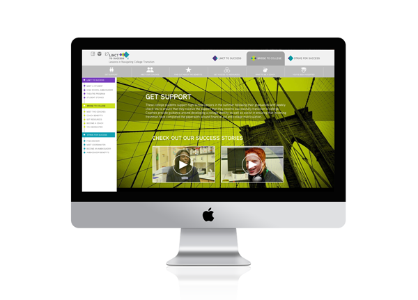
OBJECTIVE: CUNY LINCT to Success is a college access, transition and success program that strives to increase college success rates by restructuring the high school senior year through literacy, math and college access and success instruction, college placement testing, and by integrating additional social supports to smooth the transition into college. CUNY LINCT needs to be redesigned to reflect the merging of CUNY at Home in College and CARA NYC. The goal is to create engaging and interactive content to inform users about the programs and increase traffic for new and returning visitors.
TIME FRAME: 3 Weeks
RESEARCH
Surveys were sent our to everyone in our network and also to people in CUNY LINCT's network. We had 21 survey responses and conducted 17 interviews with students, stakeholders, counselors and student coaches to get information from al different perspectives.
DESIGN INFLUENCE BASED ON RESEARCH
-Website needs to be for the student
-Needs to be more engaging
-Needs to be responsive
-Restructure information architecture
DESIGN ANALYSIS
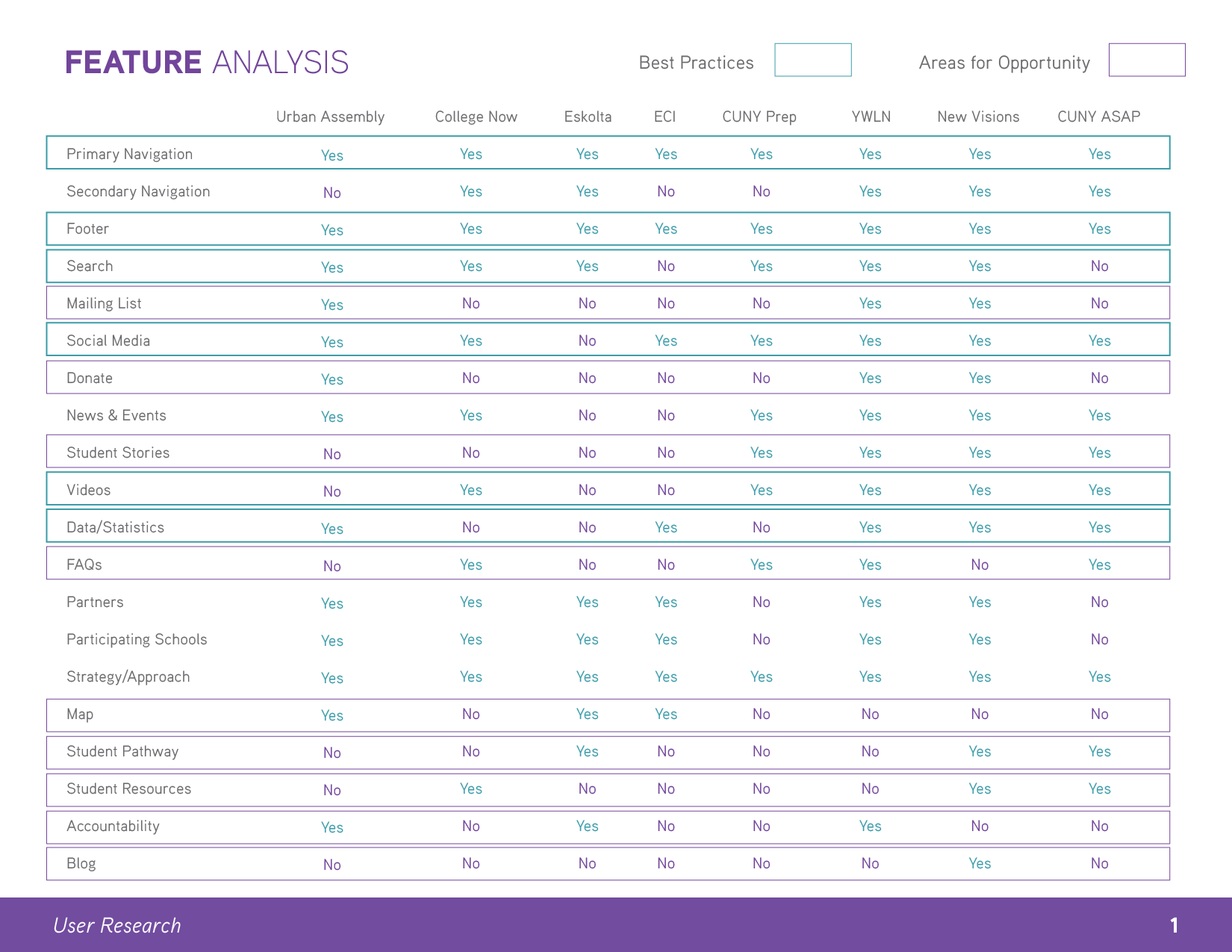
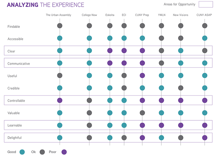
We looked at comparative college websites to see standard features, best practices and to see how these college website approach their design and navigation. We specifically were looking at each websites information architecture and how they showed their content. Every website seemed to have a lot of information in general, which was confusing and hard to find what you were looking for therefore lacked student engagement.
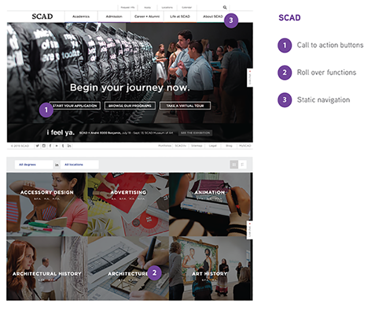
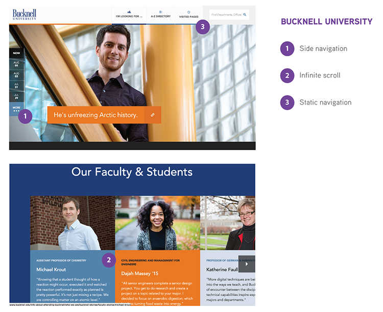
DESIGN INFLUENCE BASED ON RESEARCH
-Call to actions
-Roll over functions
-Static navigation
-Side navigation
-Infinite scroll
-Social media
-Videos and photos
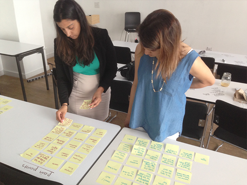
INFORMATION ARCHITECTURE
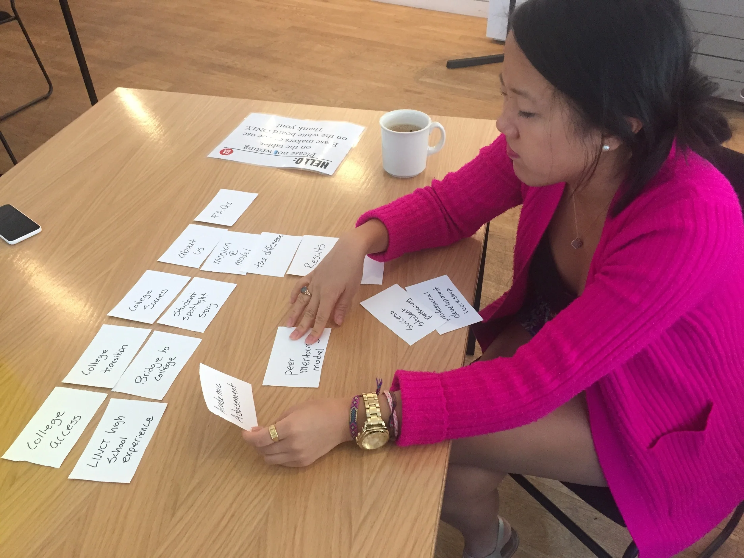
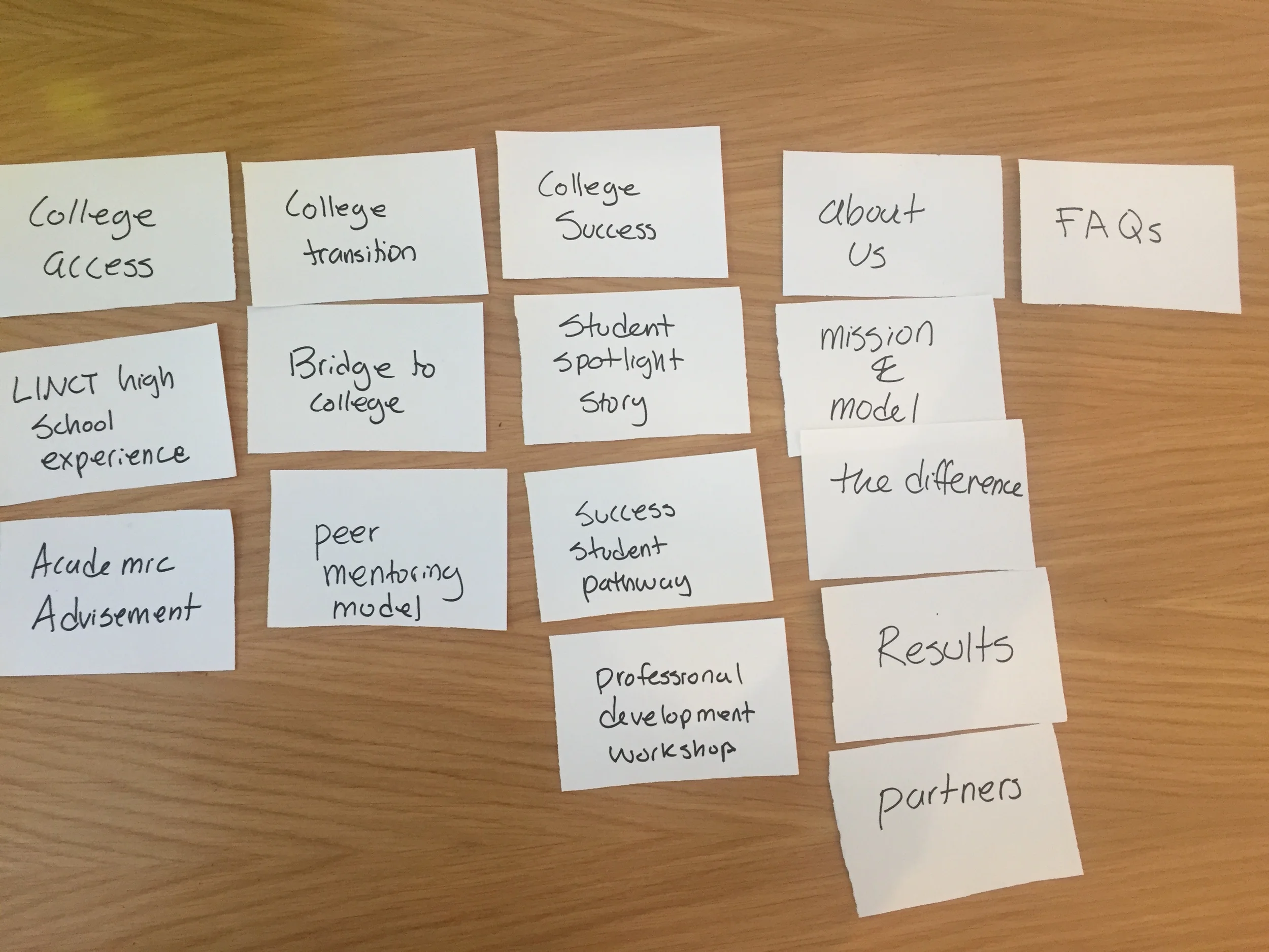
Since there was a lot of information on the CUNY LINCT's website we needed to figure out the most logical way to structure the content so it makes sense to the users. To understand how others organize information we did multiple card sorting tests. This was helpful to see the relationships between the content.
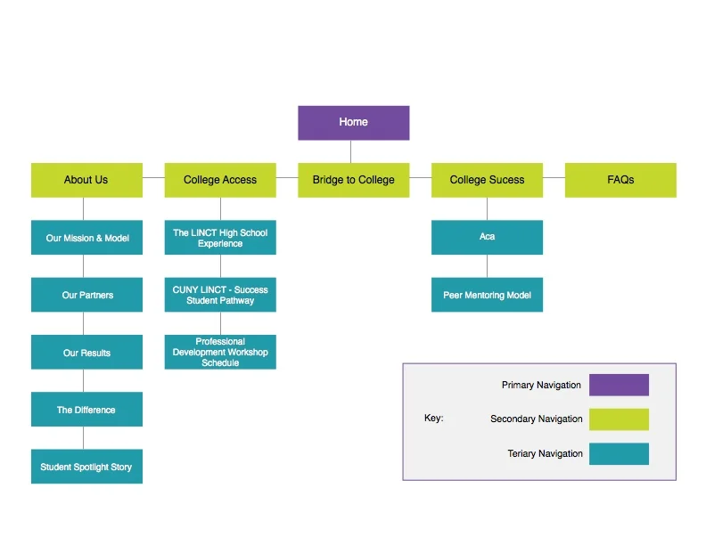
SITEMAP
Once we were comfortable with our card sorting results we created a site map to show the structures of information and relationship between the pages.
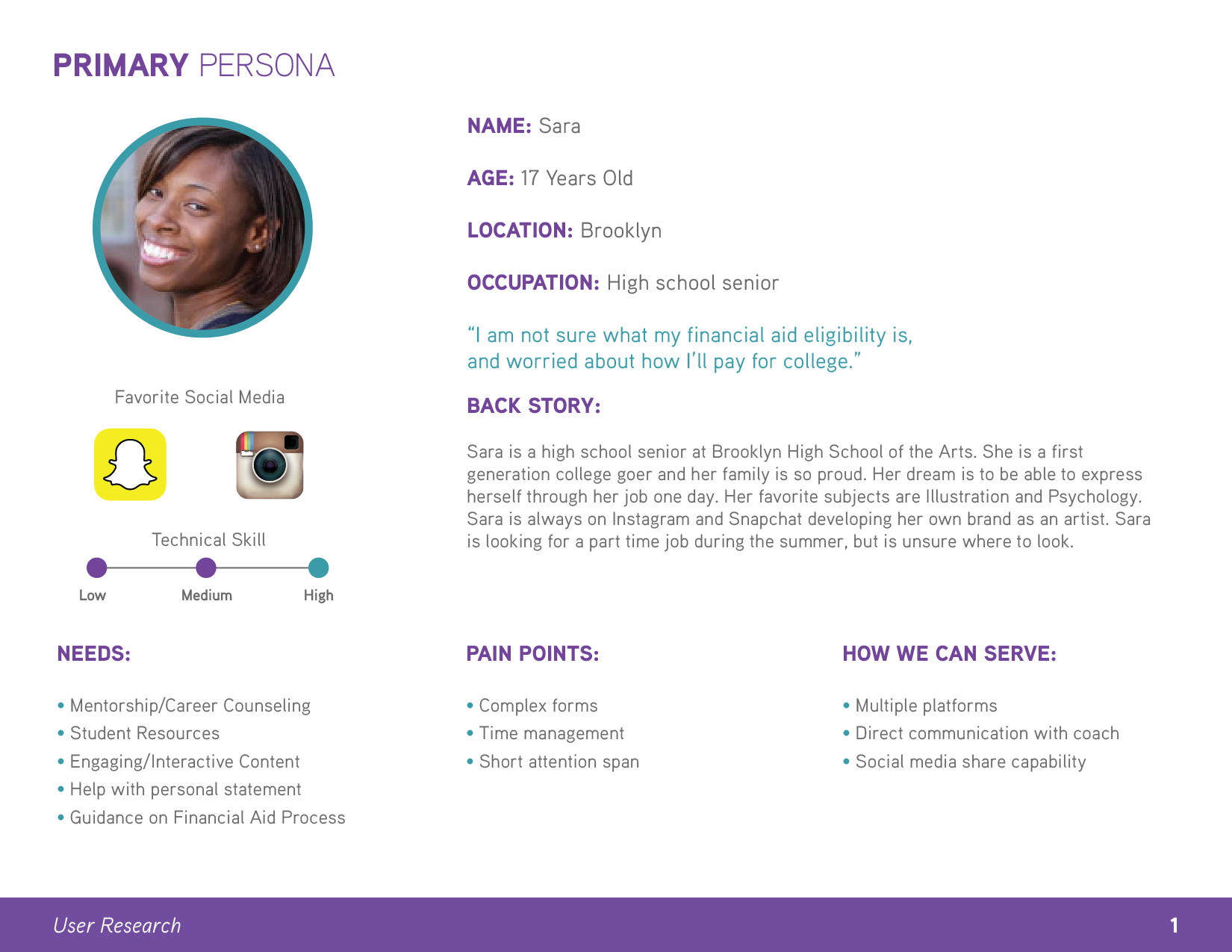
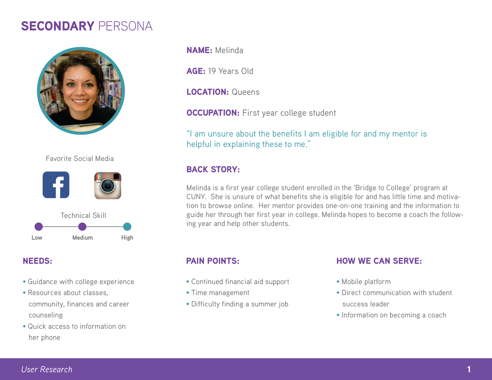
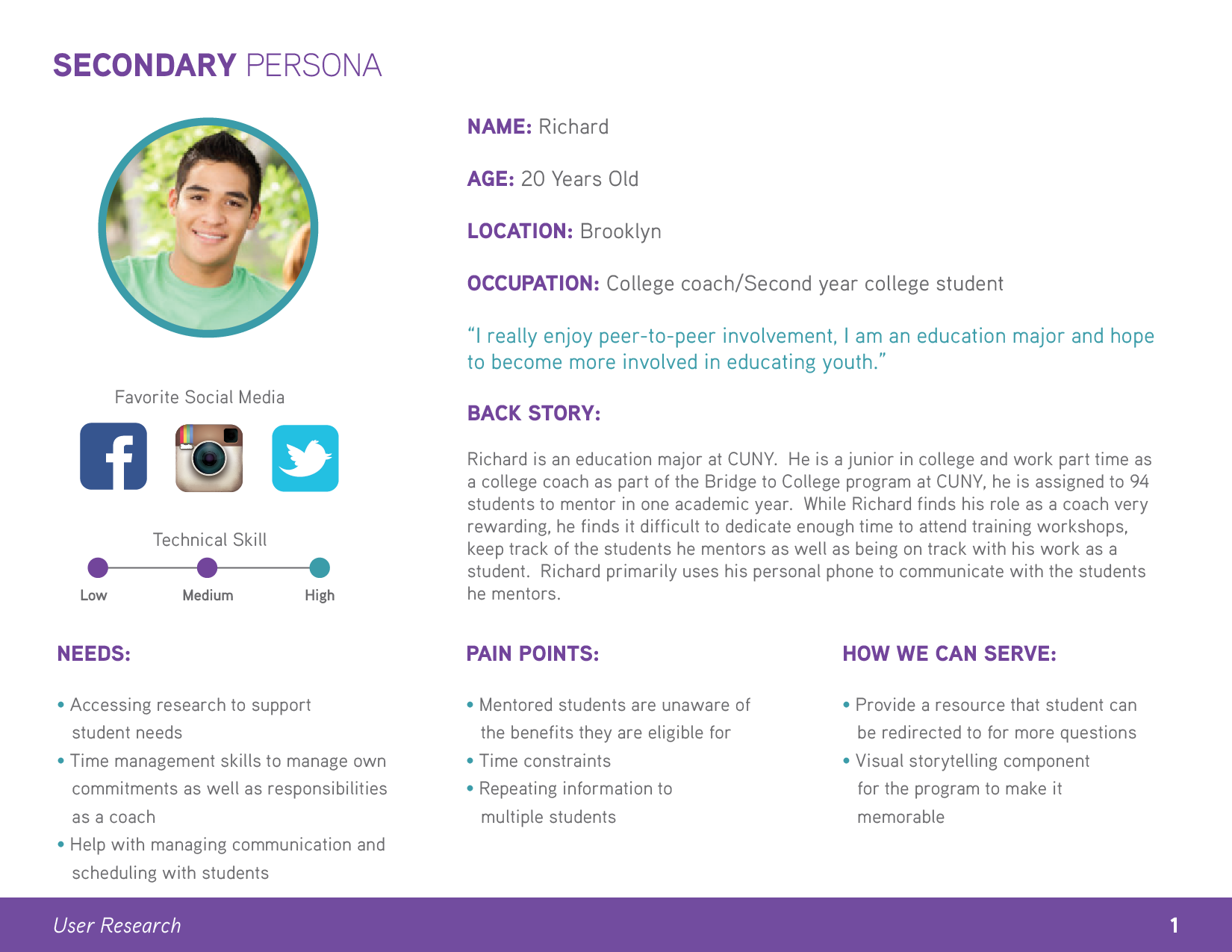
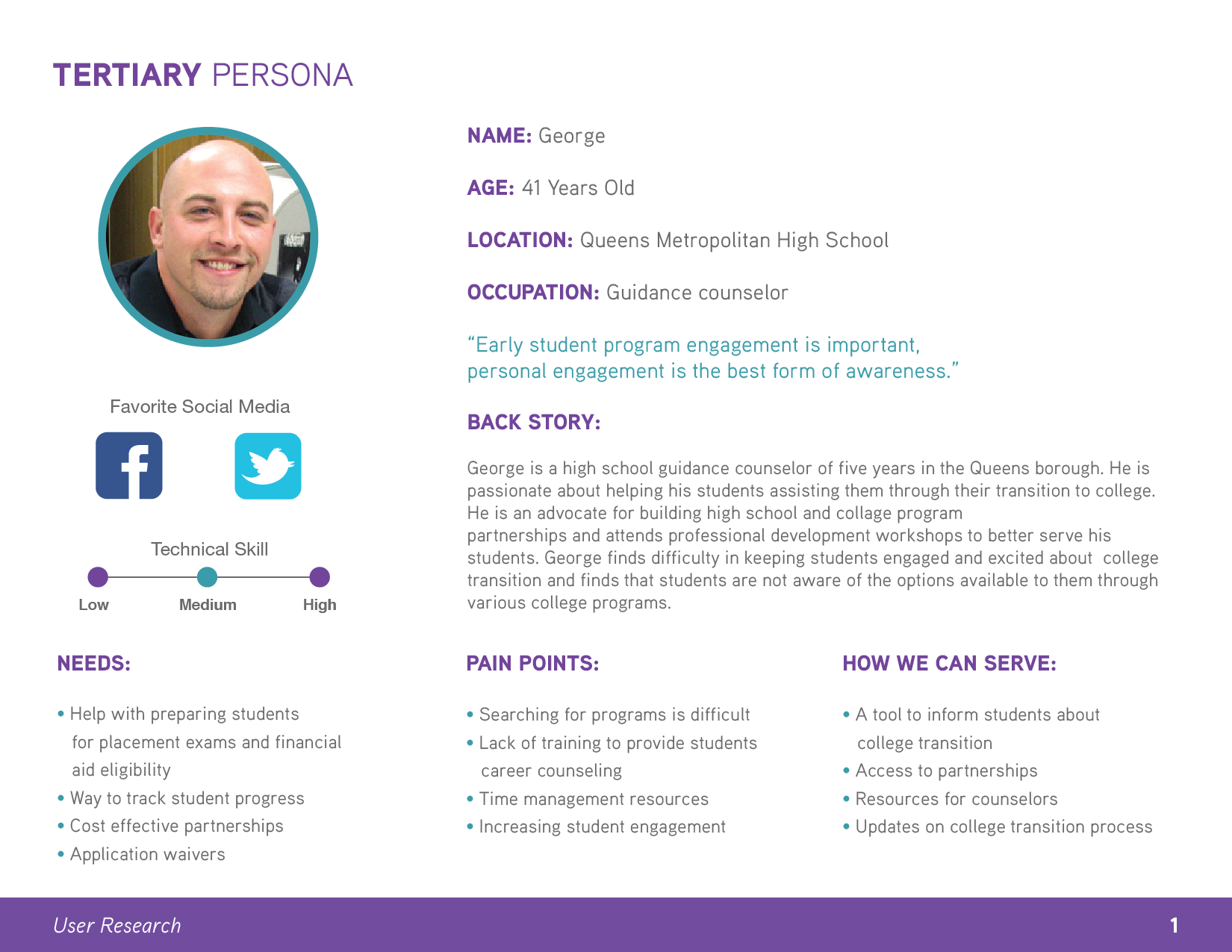
PERSONAS
From our research we summarized all problems and users into four personas. We made a high school student, two college students and a high school guidance counselor.
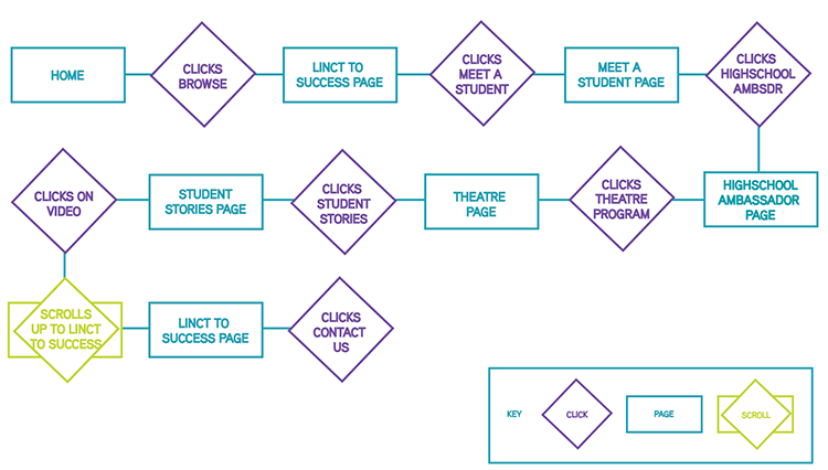
USER FLOWS
A couple different user flows were created to show how the user would interact through our site and also to see of there were any problems with navigation. We wanted the user to easily find out more about the program, the benefits and mentorship it provides, what kind of help they will receive during the transition from high school to college and to easily find someone to contact to talk about the program.
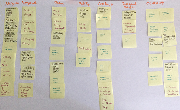
FEATURE PRIORITIZATION
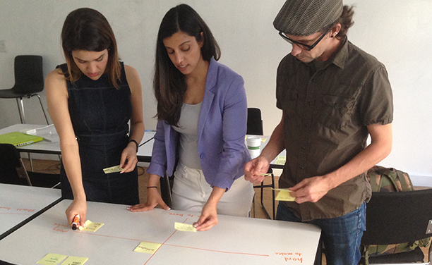
Affinity mapping and the MoSCoW method were used to prioritize features that helped the users understand the program and benefits, become more engaged, see previous students experiences, and connect through the program's social media.
DESIGN INFLUENCE BASED ON RESEARCH
Student/Partner/Financial Aid Resources
Be able to follow/track pathway and benefits
Social media integration and tracking
Search information and topics
Interactive Student Spotlight Page (videos)
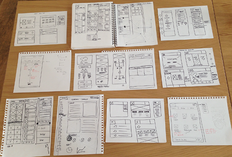
SKETCHING
USABILITY TESTING
Three rounds of testing were conducted on our prototype. Mainly we were testing to see if the content was findable was clear, if the navigation made sense, and if the information was understandable.
Usability Testing 1
Usability Testing 1
NEXT STEPS
Next we would like to make a responsive website so students could use this website on their phone. We would like to test and interview more users to make navigation easy and information findable. We would like to integrate this interactive student journey with CUNY LINCT's current homepage.